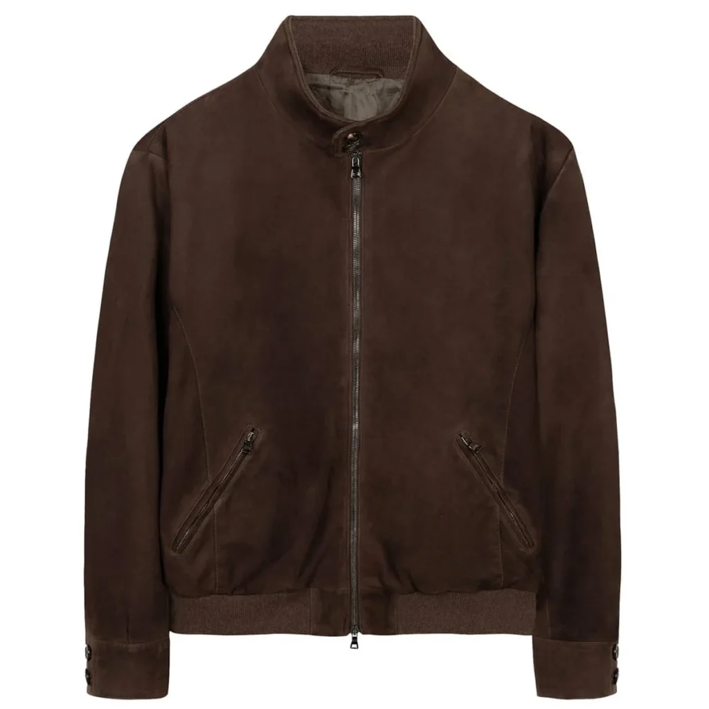
Every October, I open my wardrobe and I see the same three colours. Same cream, same grey, same dark coat. For years I fought it, convinced that a “proper” autumn wardrobe needed something bolder. Last week, in a fitting room in the middle of my studio, it finally clicked: the reason my autumn outfits never felt like me wasn’t a lack of colour. It was that I was wearing colour I didn’t love, in ways I didn’t plan.
So this year I stopped buying trends and started building a palette. Eight colours, each one with a job — and each one with a combination you can actually pull off without thinking. That’s the whole system. No more guessing at the rack.
Chocolate
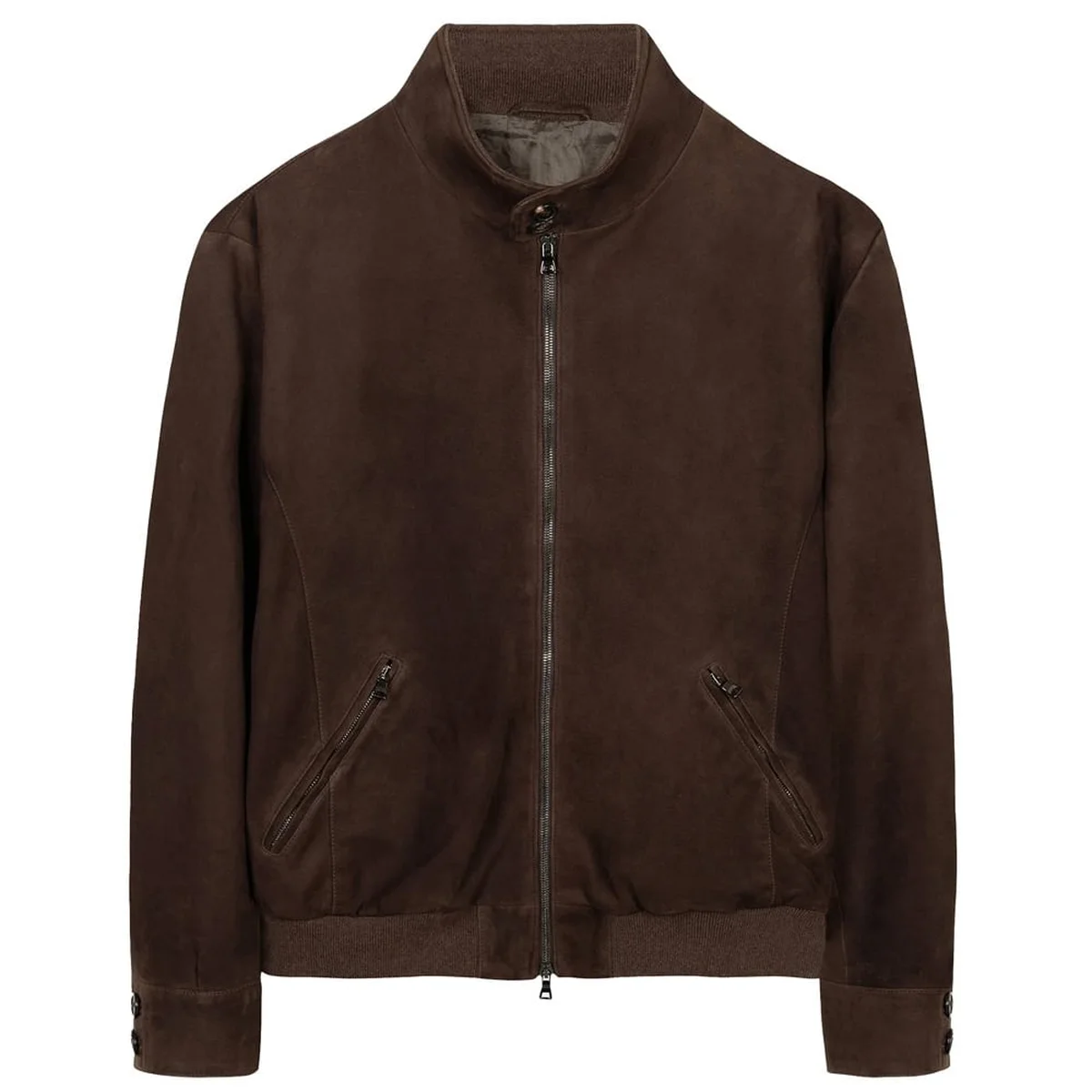
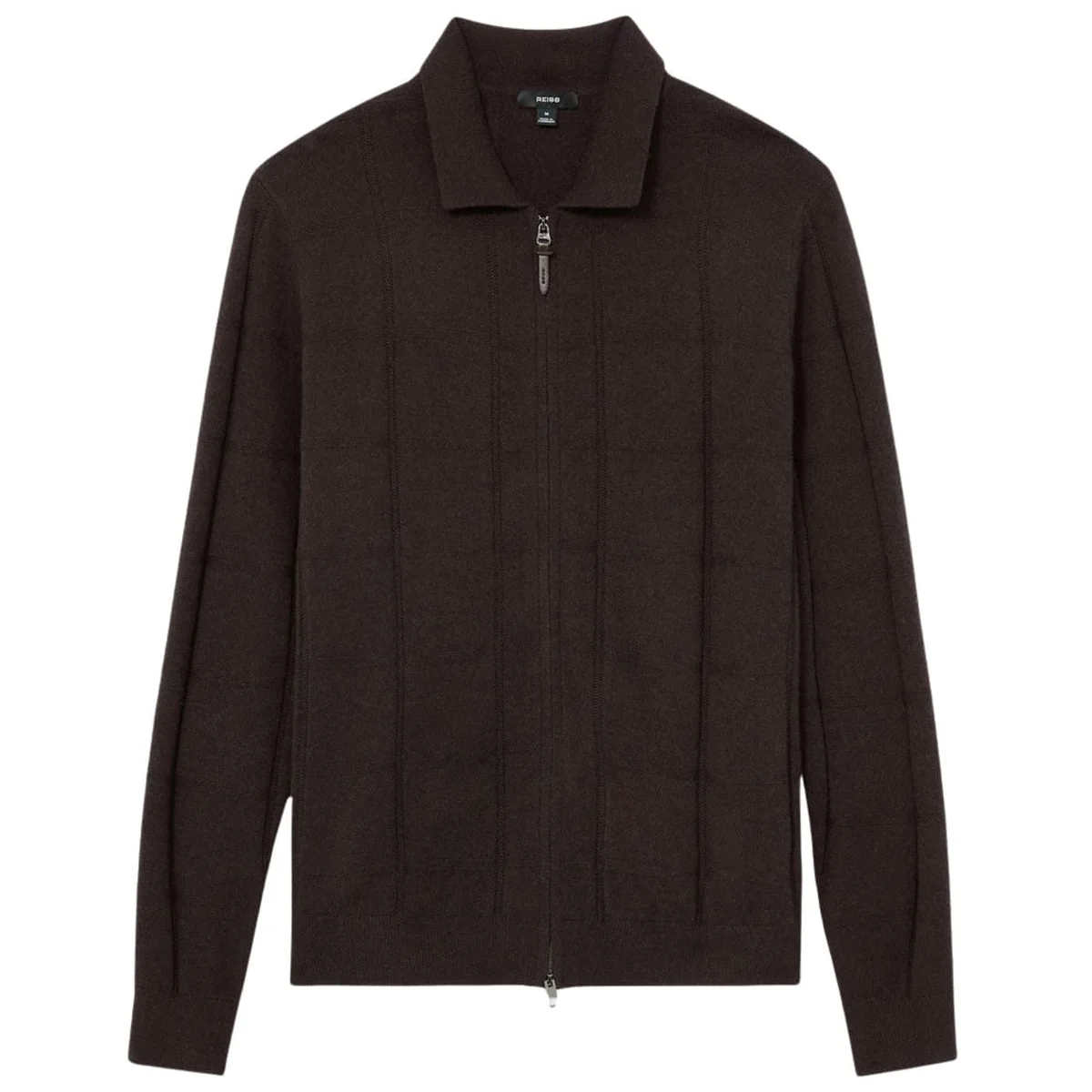
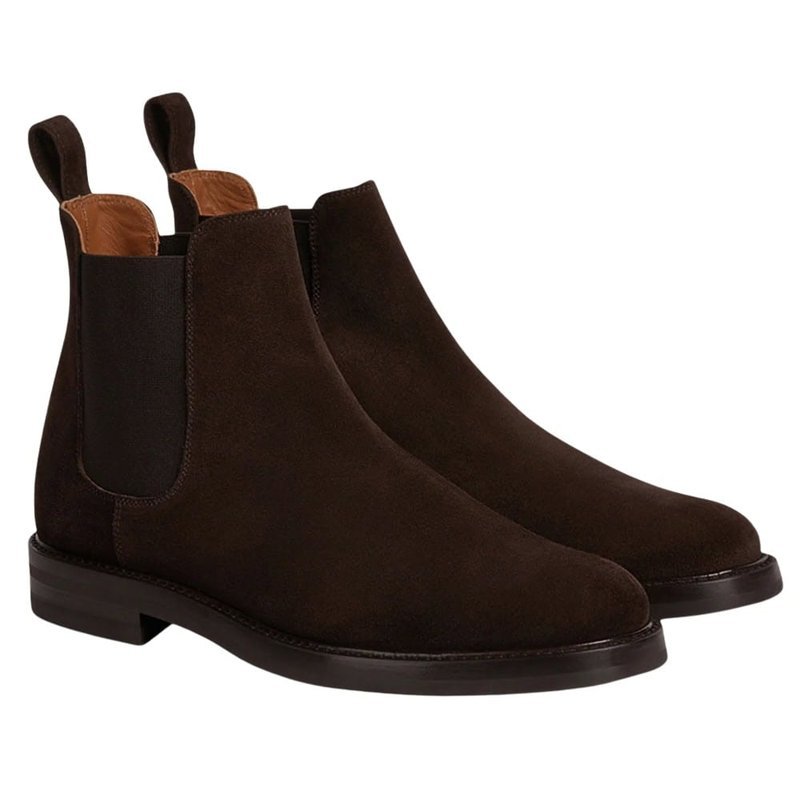
Warm brown has been building momentum ever since “Mocha Mousse” was named Pantone’s colour of the year in 2025 — and this season, chocolate has become its most wearable form. Think of it as a warmer, softer substitute for black or navy: it does the same foundational work, but with more depth and a lot more comfort.
It’s the colour I reach for on pieces that last: a suede jacket, a wool cardigan, corduroy trousers, good boots. Pair it with ecru, denim, olive — or go fully tonal and layer different shades of brown together.
Burgundy
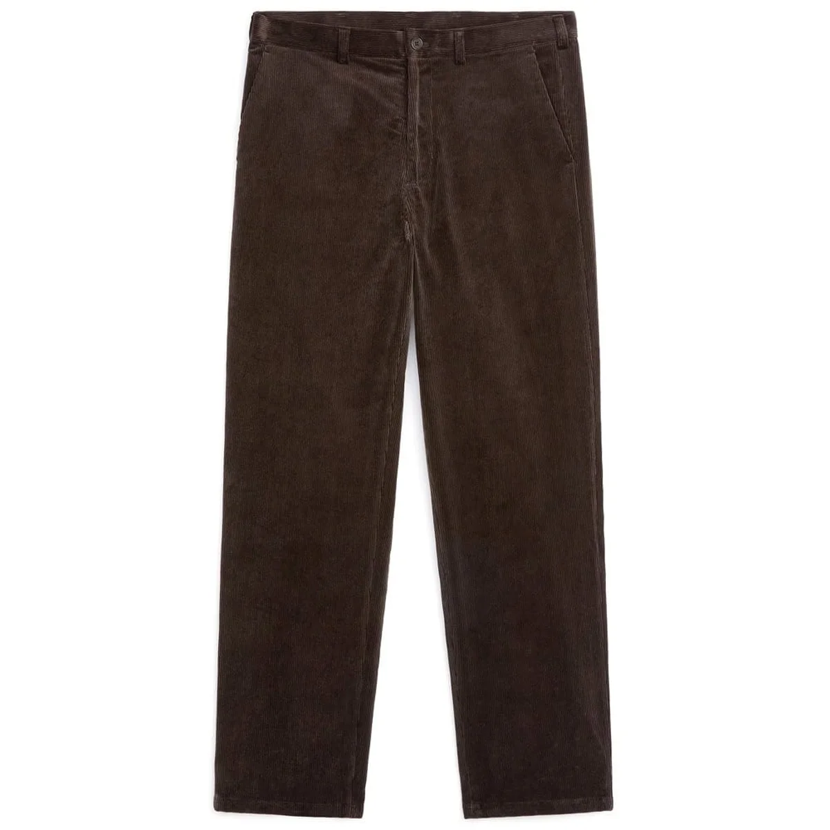
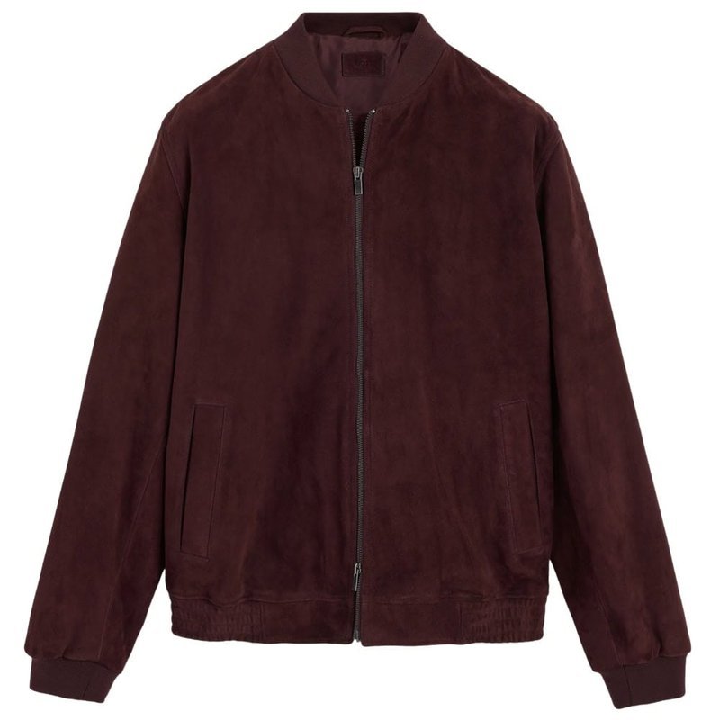
If you want colour without the announcement, burgundy is your friend. It’s dark enough to function almost like a neutral, but it has a depth that navy and charcoal simply don’t. On boiled wool, suede, or a chunky knit, it looks rich instead of loud.
Use it in place of your usual dark base — a burgundy jacket over a cream sweater, or a burgundy knit with grey trousers. It adds personality without asking for attention.
Olive
Earth tones feel most at home at this time of year, and olive is the easiest of all. With its roots in military and outdoor wear, it brings a relaxed, utilitarian energy that works on parkas, field jackets, and overshirts.
Here’s what I tell my clients: olive is the most forgiving shade in the palette. It sits comfortably next to navy, cream, brown, grey, and denim blue — which also means it works across a wide range of skin tones. When in doubt, olive is a safe first step into colour.
Burnt orange
Straight-up orange is hard to live with. Burnt orange is a different story — the saturation is dialed down, the brown and red undertones push it into the earthy side, and suddenly it sits naturally inside a neutral wardrobe.
You don’t need much. A burnt-orange knit under a dark coat, or a rust beanie with an olive jacket, gives an otherwise quiet outfit just enough warmth. It pairs beautifully with navy, olive, chocolate, and cream — and it looks best on textured fabrics like corduroy, brushed knits, and fleece.
Lime green
If 2026’s palette has a wildcard, this is it. Sharp, bright, a little acidic — and completely at odds with the muted tones around it. That’s exactly why it works: a small jolt of energy in a sea of brown and grey.
The key word is restraint. One piece, per outfit. A lime knit, a beanie, even socks, against charcoal or chocolate. Two pieces and you’ve moved from interesting to costume — and this shade is about the first impression, not the performance.
Winter white
Pantone’s colour of the year for 2026 is Cloud Dancer, an airy off-white that feels wintry and soft. It’s a gentler alternative to stark optic white, which can read as clinical — especially on the skin.
Use it for the pieces that would traditionally be bright white: tees, oxford shirts, trousers, even socks. It’s softer, and it photographs softer. For outerwear it’s beautiful, too — just choose a fabric with some stain resistance, because we all know how cream behaves on a city street.
Navy
There’s nothing trendy about navy. That’s exactly why it works. While bolder colours come and go, navy is the backdrop that lets them look good. It’s softer than black, easy to combine, and especially strong on autumn staples like wool coats and chunky knitwear.
This year, treat navy as the anchor. Layer your more directional colours — lime, burnt orange, royal blue — over it, so the outfit has a foundation instead of an afterthought.
Royal blue
Where navy blends in, royal blue steps forward. It’s brighter, bolder, and brings real energy to an autumn wardrobe while staying easy to wear — particularly next to subdued neutrals.
A royal-blue knit, fleece, or work jacket can transform a simple grey or navy base. If you’re drawn to the retro-sportswear and outdoor influences that keep running through the collections, this is your entry point.
Teal
Arguably the colour of the season. Teal sits in a useful middle ground between blue and green: characterful without being loud, and with a distinctly retro quality that harks back to 1980s and 1990s outdoor gear and fleece.
On the darker end, it’s made for autumn — it pairs easily with navy, charcoal, chocolate, and ecru, and it offers something less predictable than forest green or sage.
Depth (chocolate, burgundy, navy) + Texture (suede, wool, corduroy) + One bright accent = an autumn wardrobe that looks like you on purpose.
A quick note before you shop: this is a seasonal trend guide, not professional advice. Colours shift from season to season, and what matters is that the palette fits your skin tone and the life you actually live. If a shade doesn’t feel like you in the fitting room, it isn’t — no need to argue with it.
a note from Isabelle
You already own more of these colours than you think. The cream you have. The navy. The brown jacket you keep wearing. This year, just build around them — one colour at a time, one combination at a time. Style isn’t about becoming someone else. It’s about recognising who you are, in a palette you love.
Keep reading:
- How to build a capsule wardrobe that works all autumn — see my capsule wardrobe formula
- What I actually reach for when the temperature drops — my everyday autumn outfits
- How to layer without adding bulk — a layering guide for cold-weather confidence